Monday, September 28, 2015

Henrik Drescher


I like this piece because it does not just have a flat aspect to it. It has actual objects glued to it. It also has a cool passage that is not written, but it is cut out letters that are glued on. He also as a very specific style that can not be mistaken for anyone else's. I also like how it gives a childish yet mature feel of it as well.


I like this piece because it looks very dark and urgent. The only words that are really visible is forgotten bomb and this kind of shows how his mind works. I also like how the images on the paper are edgie and could easily offend someone. Also it's just different which I like. The pen drawn head also gives a sense of not everything is as it seems.

Friday, September 25, 2015

Cumulative


A. The way in which I used lines to describe the form of the clip is by inside having the lines curve to show the clip was hollow and showing how it curves. Also on top the line has a sharp curve and goes down to show that it has a curved top and flat surface after the curve. Also the further away the clip is the lighter the lines get. The half elipses on the two handles shows how it is rounded.

B. What makes my piece creative and unique is that the lines on the surface go back into space to give it a 3D aspect to it. I also have the back ground chaotic to differ from the crisp and sharpness of the clip and table. The lines also go into the bright section which helps guid the viewers eyes around the page. There are also blocks in the corners of the page to break up the symmetry and lines that go to the middle.

Modeled 2


The way in which I used lines creatively is by having each surface of line going in different directions to show that it is a different surface. I also used the straight lines to show flat surface and slightly curved ones for the rivets inside the nut. Also the further away it is the lighter the line is while the closer it is the darker it is.

Modeled 1


The way in which I used line to creatively is by having them be elipses without the back half on the Handel and top half of the clamps to show that it is rounded. I also used straight lines to show flat areas on the pliers. The further away the part of the pliers was away I also tried to draw lighter to push it into the distance.

Mass gesture 2


The way in which I used line creatively is by making an extreme perspective. Also up close is extremely dark with a lot of detain. While further away it gets faint with little detain. It also completely fades away at the end.

Mass Gesture 1


I used lines  creatively y showing things up close for details. The closer it was the more lines and details were. It would also be darker and thinker. While far away would be lighter and not as clean of a line. This gives the perception of depth. I also did circular marks in the back ground to give a different form of line to kind of zoom in on the skull and direct the negative space.

Tuesday, September 22, 2015

My negative space

Negative space of another persons piece


The shapes inside of the picture are very well drawn. I also like how it is very little black in the background so it creates interesting shapes within the negative space. Especially inside the hand with the wrinkle lines and finger prints. There is also a lot of different things within the picture which makes the drawing interesting. Such as the snow and rain, or the meteorite and the Leaning Tower of Pisa. There is also very well done visual hierarchy. For example he makes the hand appear up close and large. There is also a lot of detail in the hand with the finger print, but with the leaning tower it is farther back because it is up higher on the page. It is also smaller than the hand with less detail causing it to look further back in space.

Monday, September 14, 2015

Pipe 5


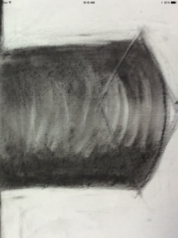
I used the charcole stick and my fingers to shade the pipe. I also used the eraser to show where the light areas are and where the light hits it the pipe. The eraser to differentiate between near and far with blurry and crisp lines. This is a different picture from a regular one because the eraser lines were very expressive and they stood out. There was also the blurry and crisp lines.

Pipe 4


The way in which I creatively used the drawing tools is by darkening the picture by using the charcole stick around the edges then making crisp lines using the charcole pencil. Then I used my hand to blend the middle gray tones in the picture and left my finger and hand marks. I also used the eraser to show where the eclipses fit into the boxes. This is a unique and not like regular pictures because it actually has my finger prints in the picture. It also has very dark lines and expressive lines.

Pipe 3


The tools that I used was a charcole pencil, charcole stick, and my hand. First I traced the boxes and the shape of the pipe out with the charcole pencil. Then I went in with the charcole stick to add the shadows. After I added wher the shadows I would blend with my finger and drag the charcole stick back over the shadows to make it texturized. I also erased where the light areas were. This is different from a regular drawing because you can see the texture from the charcole stick making it look unique and different.

Pipe 2


I creatively used the drawing tools to get crisp edges and extreme darks. I used the stick charcole, water, and a small paint brush to get crisp dark edges to show it was in shadow. I also used the the charcole pencil to make the box appear. There is also eraser marks where the lightest values are. This drawing is different because you can see how the elipses fit into the perspective boxes. The darks are also extremely dark in certain areas to show contrast.

Pipe 1


This is creative because it is I used the charcole pencil to do small details and the charcole stick to add in the shadings. I also used my hand and paper towels to do blending. This is different from a regular drawing because you can see the blending streaks where the curves are.

Wednesday, September 2, 2015

Line drawing


1. I used two sheets creatively by making the papers look like two mirrors that I had used. (They were at two different angles). The orientation of the paper is to match the orientation of the mirrors that I used.
2. Yes, I used the continuous line technique.
3. Something I could do better is that I could do less shading with the lines so that way you could see better that it was one line.